
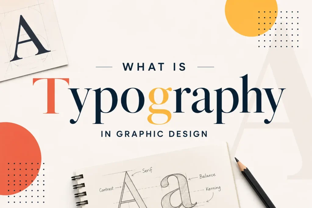
Typography plays a central role in how visual communication is perceived, often before the content of a message is even read. What is typography in graphic design refers to the deliberate arrangement of text, font selection, spacing, size, and alignment, to communicate clearly and create the intended visual impact.
Every typographic decision influences how a design is received. This guide explains what typography actually involves, where it appears across different design formats, and why it holds as much importance as the content itself, a principle taught early in design programs across Pakistan.
Definition of Typography in Graphic Design
The typography definition centers on the visual arrangement of text to make written content both readable and intentional. It goes beyond selecting an appealing font, it involves deliberate decisions about weight, spacing, and alignment that shape how a design functions.
Typography in graphic design applies at every scale, from a single word on signage to full paragraphs of body text on a website. Effective typography often goes unnoticed by the viewer, since well-structured text communicates without drawing attention to its underlying mechanics.
Where Is Typography Used in Graphic Design?
Typography appears in nearly every design that includes text, which accounts for the majority of visual design work produced today.
Logos depend heavily on custom or carefully selected typefaces to establish brand recognition. Websites rely on typography to guide a visitor’s attention, headlines, subheadings, and body text working together to maintain engagement. Print materials, including posters, packaging, and brochures, depend on typography to communicate quickly, often within seconds of capturing a viewer’s attention. User interfaces in mobile and web applications similarly rely on typography to keep labels and instructions clear and easy to scan.
Read More: What Is Graphic Designing?
How Typography Impacts Design
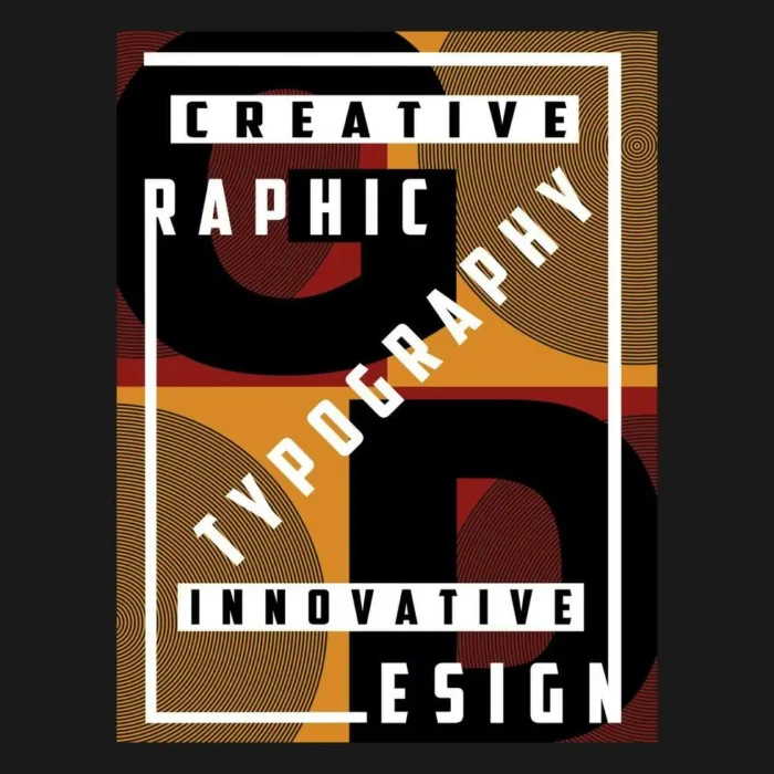
Typography shapes perception before a viewer consciously processes the reasoning behind it. A bold, heavier typeface often communicates confidence or urgency, while a lighter, more refined font tends to suggest sophistication or calm.
Readability directly determines whether a message is actually received. Poor spacing or a difficult-to-read typeface discourages engagement, regardless of the quality of the underlying content. Typography for graphic designers functions as a communication tool, not merely a decorative choice, and it directly affects how effectively a message reaches its intended audience.
The Different Styles of Typography in Graphic Design
Several distinct typography styles appear across different design contexts, each contributing a different visual tone.
- Serif fonts — feature small decorative strokes at letter edges, often used to convey tradition and reliability
- Sans-serif fonts — use clean, modern lines without decorative strokes, commonly applied in digital interfaces for clarity
- Script fonts — resemble handwriting or calligraphy, typically reserved for elegant or personal branding
- Display fonts — bold and decorative, designed specifically for headlines rather than body text
- Monospace fonts — maintain equal character width, frequently used in technical or code-related contexts
Selecting the appropriate style depends entirely on the intended message and target audience.
The Elements of Typography in Graphic Design
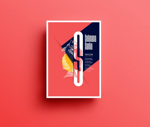
Several core elements work together to determine how typography functions within a design.
- Typeface — the overall font family selected for a project
- Font weight — the boldness or lightness of the letterforms
- Kerning — the spacing adjustment between individual letter pairs
- Leading — the vertical spacing between lines of text
- Hierarchy — the use of size and weight to guide reading order
- Alignment — how text is positioned within a layout, left, center, right, or justified
Understanding these basics of graphic typography allows a designer greater control over communication, rather than relying solely on visual appeal.
Common Typography Mistakes Beginners Make
Several recurring mistakes tend to limit designers who are still developing their skills.
Combining too many typefaces within a single design often creates visual inconsistency rather than variety, most professional work is limited to two or three fonts. Neglecting proper spacing between lines and letters reduces readability, even when the chosen typeface is otherwise appropriate. Applying decorative display fonts to large blocks of body text is another common error, since these fonts are designed for headlines, not extended reading. Omitting hierarchy entirely, treating all text with uniform size and weight, leaves viewers without clear guidance on what information matters most.
Conclusion
What is typography in graphic design ultimately concerns intentional use of text, not simply selecting a visually appealing font. Readability, tone, and hierarchy all depend on typographic decisions that shape how effectively a message reaches its audience. LocalPro1 Institute offers a Graphic Designing course in Rawalpindi that covers these principles in depth, preparing students across Pakistan for practical design work. For those based in Islamabad or Rawalpindi seeking structured, hands-on training, LocalPro1 Institute provides a strong foundation in design fundamentals. Contact LocalPro1 Institute today to begin developing professional design skills relevant to Pakistan’s growing creative industry.
FAQs
Why does typography matter in graphic design?
Typography affects both readability and emotional tone, directly influencing whether a message is effectively received by its audience.
What’s the difference between a serif and sans-serif font?
Serif fonts include small decorative strokes at letter edges, while sans-serif fonts use clean lines without any decoration.
How many fonts should a design use?
Most professional designs use two or three fonts to maintain visual consistency and avoid unnecessary clutter.
What is kerning in typography?
Kerning refers to the spacing adjustment between individual letter pairs, ensuring text appears balanced and legible.
Can typography affect how trustworthy a brand looks?
Yes. Font choice directly influences perception, certain typefaces convey professionalism, while others feel more casual or informal.